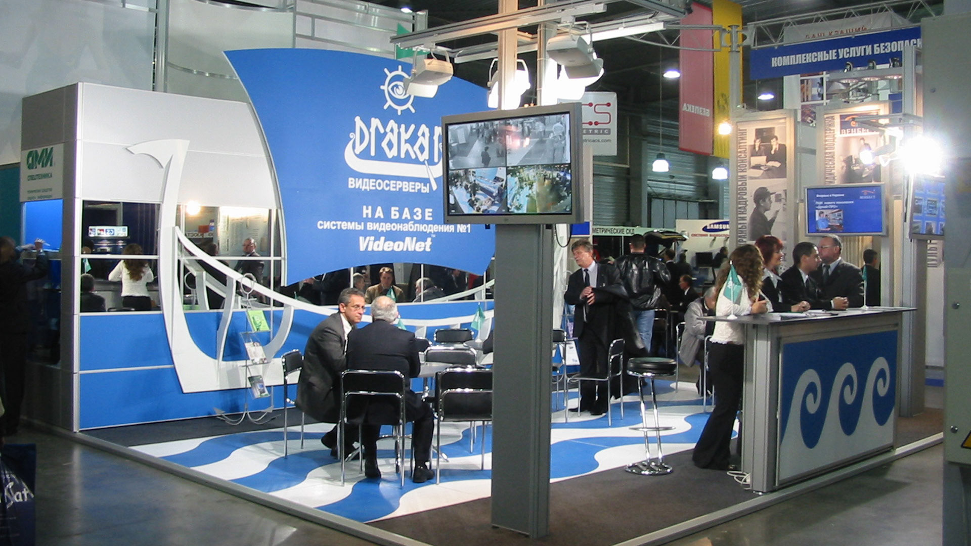
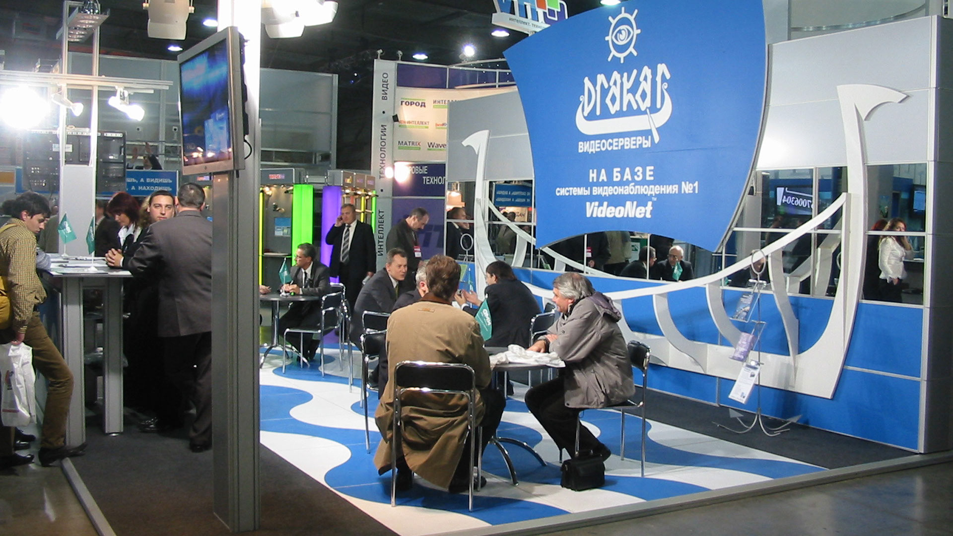
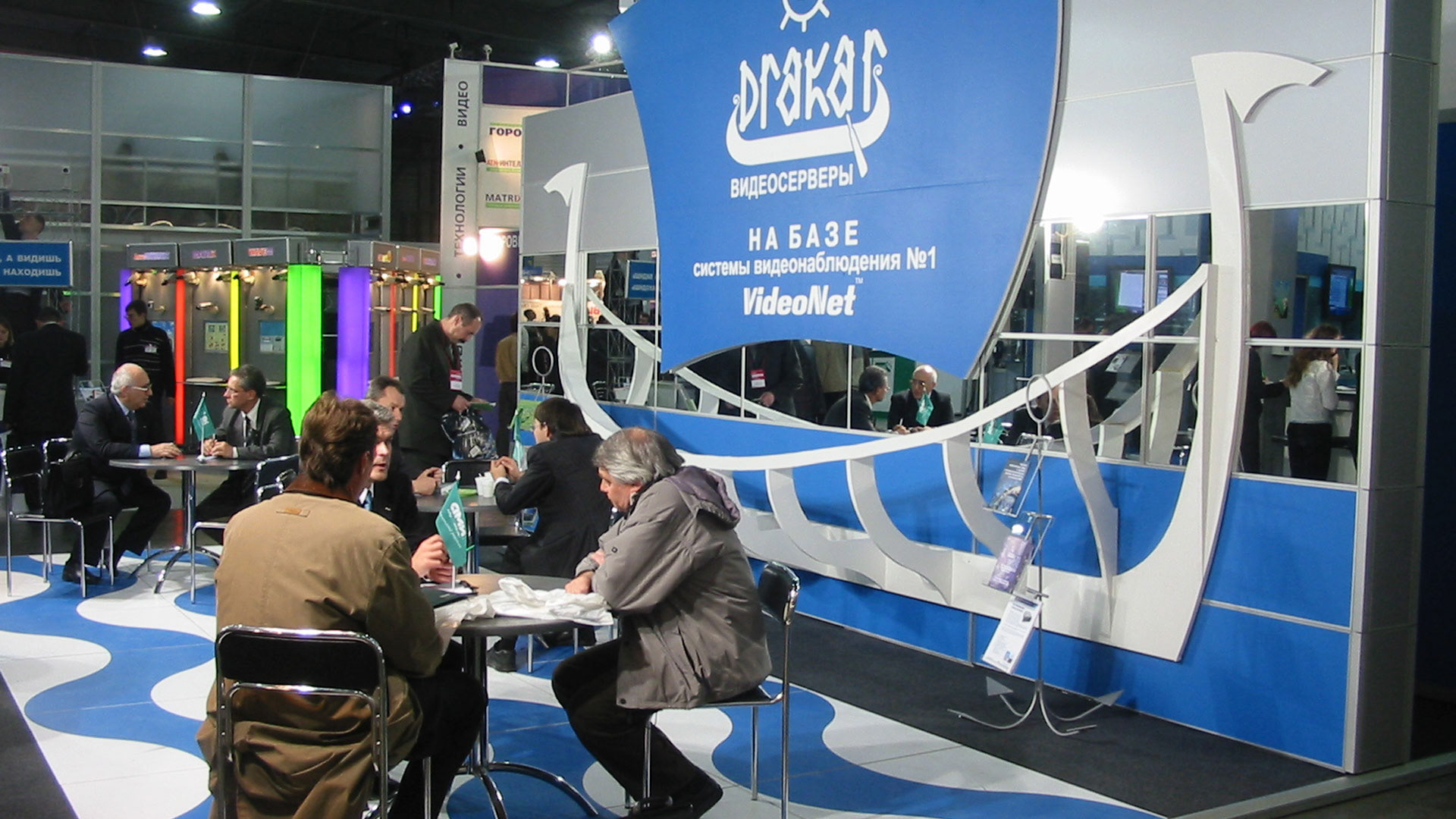
I would call this stand "theatrical". "Overcoming" the name and logo of the company were developed stylistic accents: the skeleton of a drakar, a Viking ship, background wall with a mirror strip for the visual increase in space and, finally, - imitation of waves on the main podium area.